


HAAN
↓
Art Direction
Content Creation
Social Media
Shake it up
After the great success with their first collection of hand sanitizers, HAAN saw the need to expand their range of products.
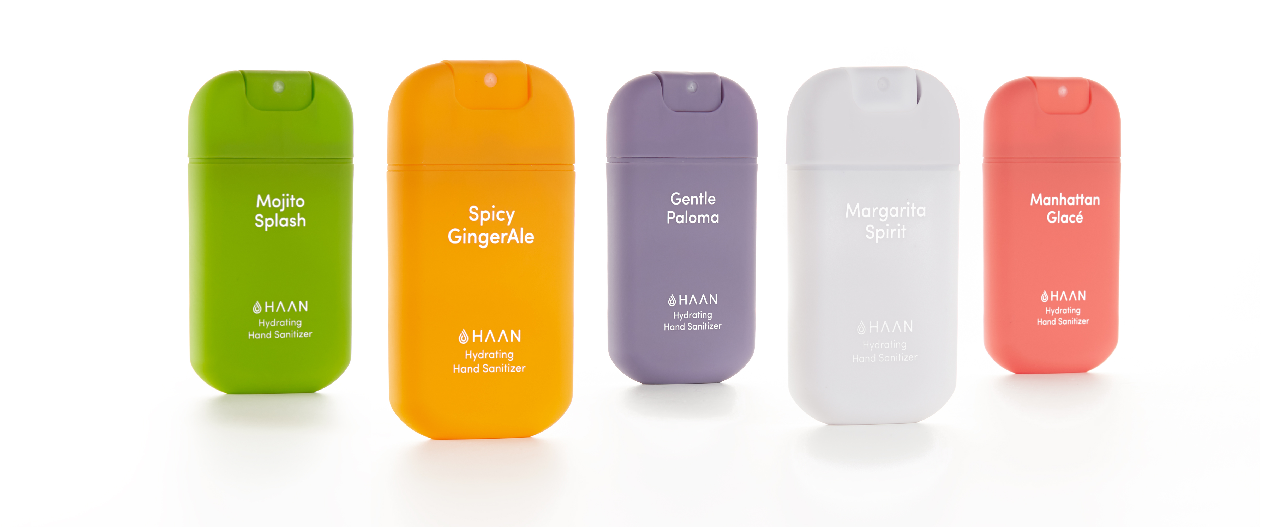
This is how Shake It Up first started: a collection for the fashion industry inspired by our favorite classic cocktails revisited with a twist.
The magic recipe
In search of a creative concept that had to be appealing but foremost, trendy; the art of mixology instantly made sense. A universe that mixes colors, flavors, and alcohol and that is directly linked to creativity, fanciness, and sophistication.

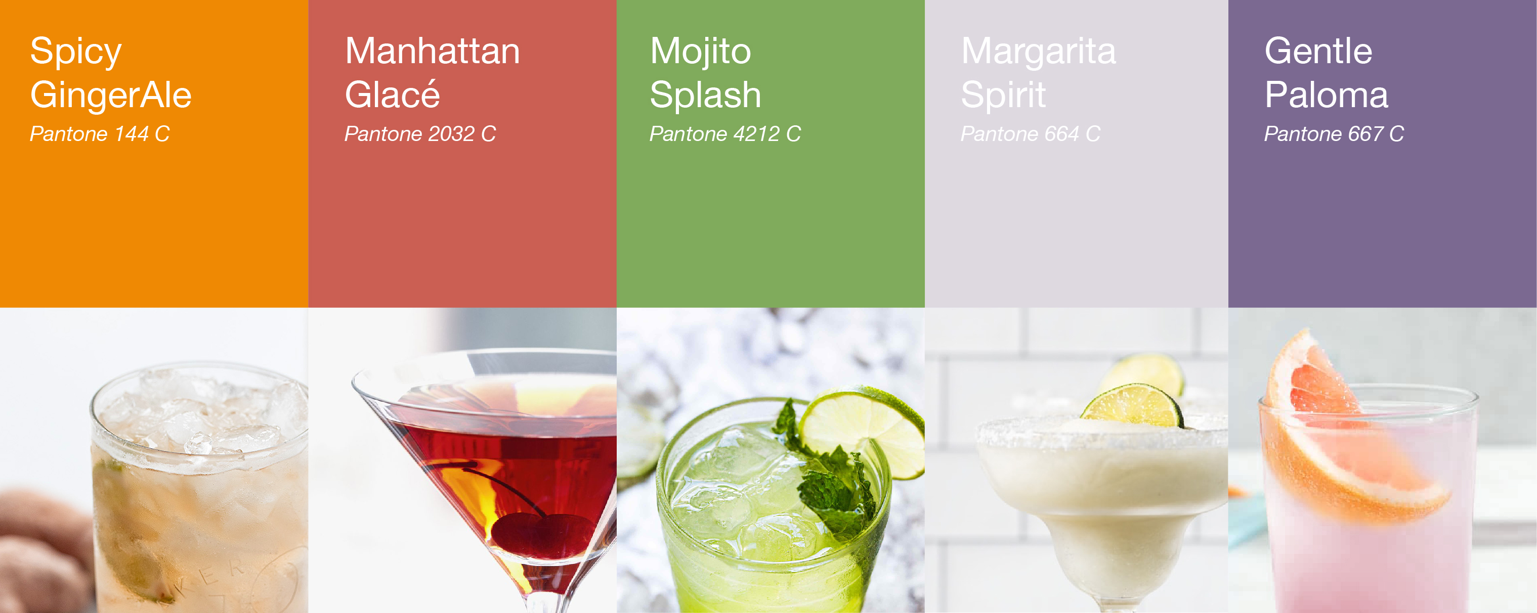
Five of the most classic and well-known cocktails will now be the new scents of the brand. Assigning each of them a strong and bright color and an individual name that was understanding but distinguishable, that would recall the experience of drinking that booze.
The mix of delightful ingredients
Of course, a disruptive collection like Shake It Up, needed a new art direction that followed the brand identity guidelines by being clean and pop, but at the same time was recognizable for itself.

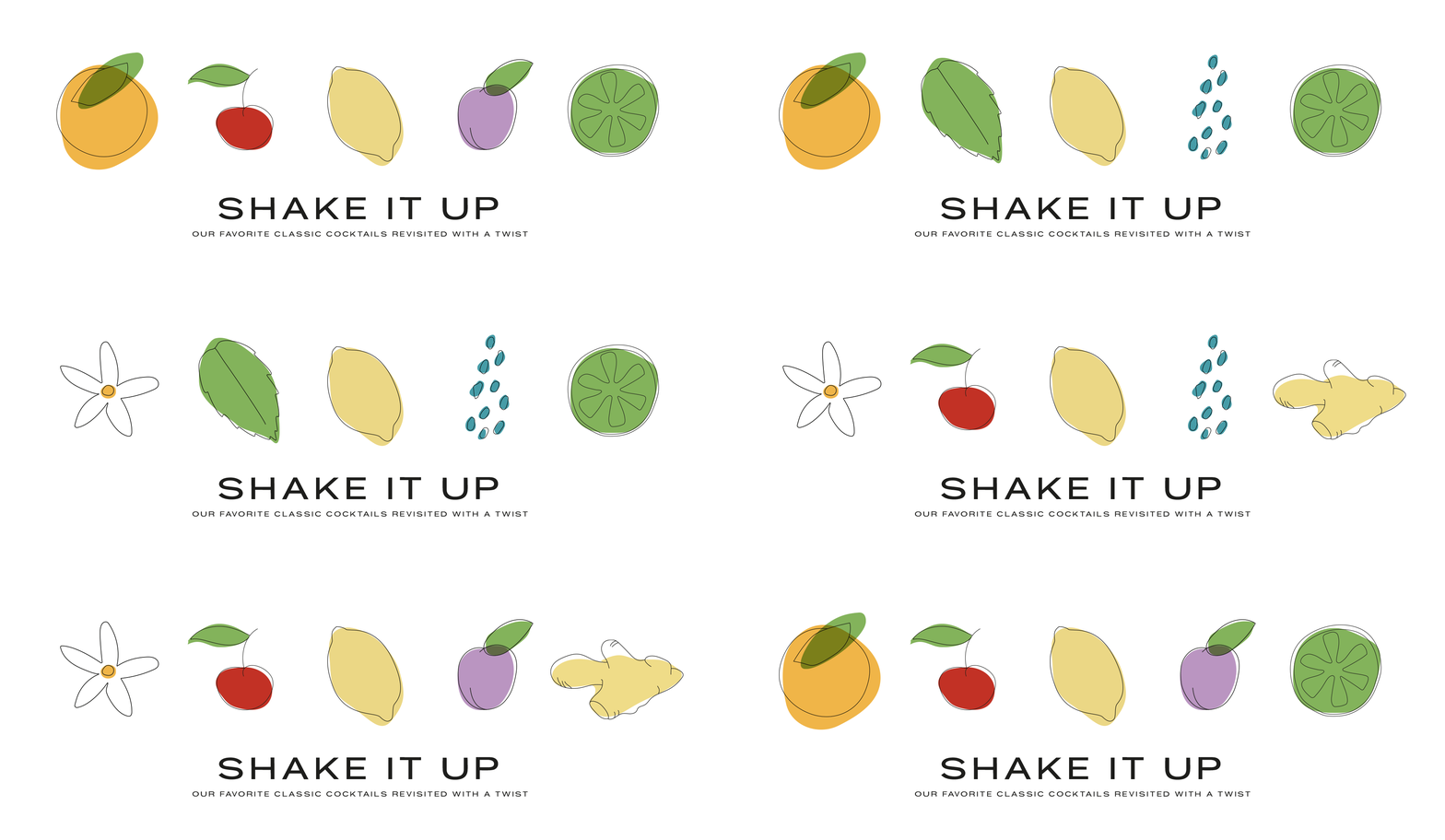
Inspired by the old illustrations of well-known drink brands from the 60s and 70s, we portrayed all the drinks and their ingredients in fine lines with irregular-shaped blocks of colors in order to radiate freshness, positivity, creativity, and contemporary.


Adding the cherry on top
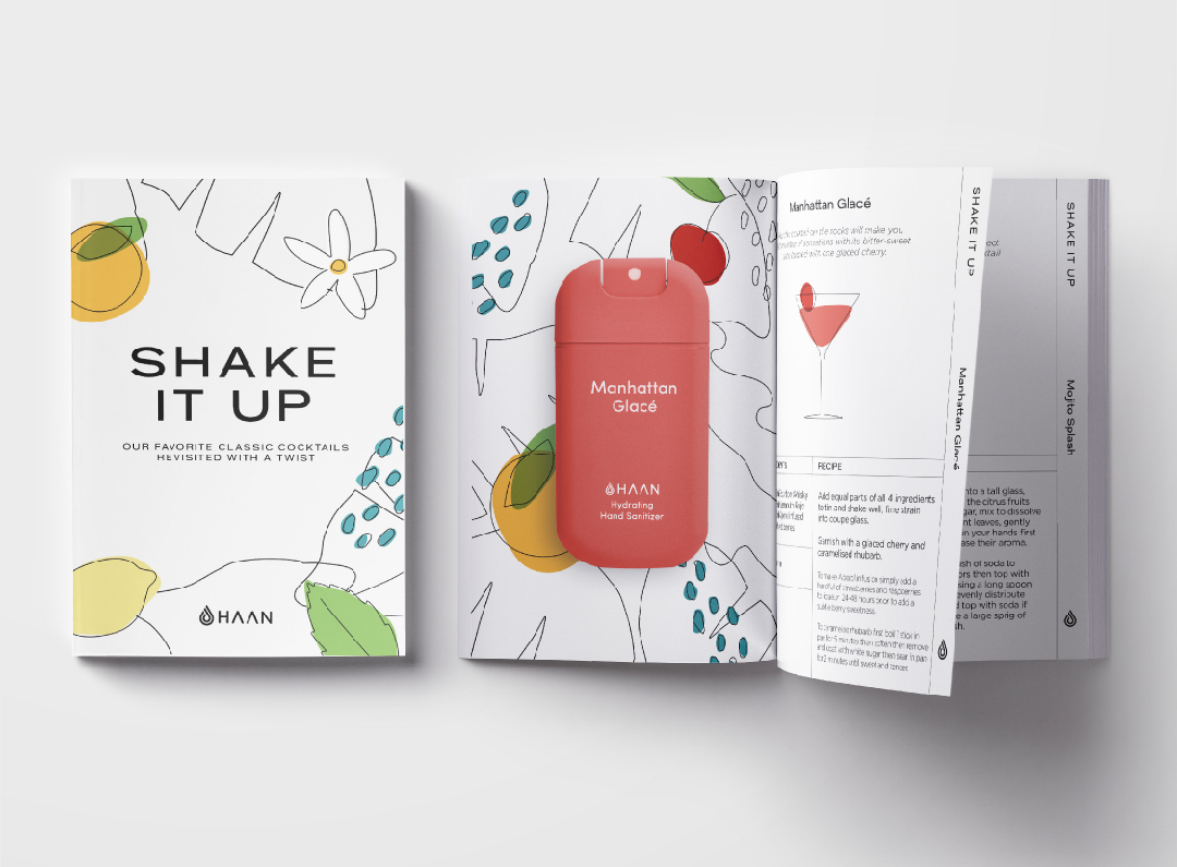
To boost the ambassadors' strategy, we created a recipe book with the recreated classic cocktails and their parallelism with the new HAAN fragrances.
↑
See Again

HAAN
Art Direction
Content Creation
Social Media
Shake it up
After the great success with their first collection of hand sanitizers, HAAN saw the need to expand their range of products.
This is how Shake It Up first started: a collection for the fashion industry inspired by our favorite classic cocktails revisited with a twist.

The magic recipe
In search of a creative concept that had to be appealing but foremost, trendy; the art of mixology instantly made sense. A universe that mixes colors, flavors, and alcohol and that is directly linked to creativity, fanciness, and sophistication.

Five of the most classic and well-known cocktails will now be the new scents of the brand. Assigning each of them a strong and bright color and an individual name that was understanding but distinguishable, that would recall the experience of drinking that booze.

The mix of delightful ingredients
Of course, a disruptive collection like Shake It Up, needed a new art direction that followed the brand identity guidelines by being clean and pop, but at the same time was recognizable for itself.

Inspired by the old illustrations of well-known drink brands from the 60s and 70s, we portrayed all the drinks and their ingredients in fine lines with irregular-shaped blocks of colors in order to radiate freshness, positivity, creativity, and contemporary.


Adding the cherry on top
To boost the ambassadors' strategy, we created a recipe book with the recreated classic cocktails and their parallelism with the new HAAN fragrances.

↑
See Again